Webinar Dashboard Redesign
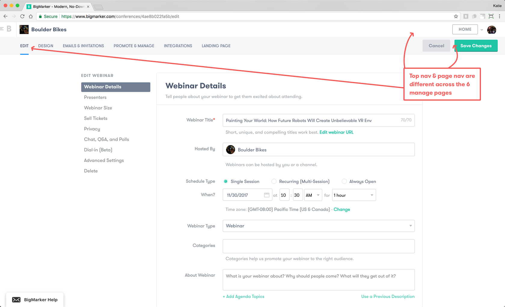
Previously, every BigMarker webinar had an Edit, Design, and Manage section. These pages contained all the tools webinar hosts need to manage their webinar.
This redesign organizes all the tools that webinar hosts need to manage their webinar in a clear, easy to use webinar dashboard.
Redesigning the Webinar Dashboard
Primary Challenge
As BigMarker transitioned from a webinar platform to a full-stack webinar marketing tool, new features were rapidly designed, built, and placed into the old framework.
The old framework was increasingly difficult to update, incorporate new features into, and use.
As a result of unorganized content, users had trouble finding the tools they needed.
How might we redesign the webinar dashboard to make it easier for hosts to find the tools they need?
Additional Challenges
BigMarker was undergoing a visual design refresh. The new styleguide was maturing and ready to be incorporated into the dashboard, which had inconsistent UI elements.
As the product was re-positioned as a full-stack webinar marketing platform, new terminology was inconsistent with existing terminology across the dashboard.
The navigation was inconsistent across pages. It disoriented users and was confusing when updating and saving changes.
With a limited design and engineering team, the redesign had to not only be elegant and usable, but also had to be designed with realistic engineering constraints in mind.
My Role
I worked closely with our customer success team to understand the problem and brainstorm possible solutions. I also worked closely with the engineering team to define the project scope and rollout process.
Understanding Pain Points
With the help of BigMarker’s Customer Success Team, we learned that the biggest problem with the BigMarker webinar dashboard was its organization. New features were squished into the catch-all “Advanced Settings,” and users didn’t understand the difference between the “Edit” and “Manage” pages.
While every webinar host configures webinars differently, overall hosts prioritize the following: sharing the webinar link, designing the landing page, gathering & tracking invitee, registrant & attendee data, adding and removing presenters, and managing the webinar recording.
Streamlining the Webinar Dashboard
Since we were working with an existing product, we began with an audit of settings and functionality. It was clear why webinar hosts had trouble finding features (I had no idea whether I should look on the “Edit” page or “Manage” page for most features). Plus, the inconsistent navigation across pages was disorienting and confusing.


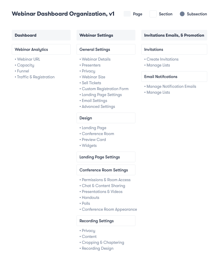
Version #1
The site organization was the focus point of the dashboard redesign. Hosts need to easily find features and tools they need. The first version focused on simplifying the information architecture as much as possible, while recycling the existing UI.
I experimented with categorization, menus, navigation, copy, layouts, and graphics.
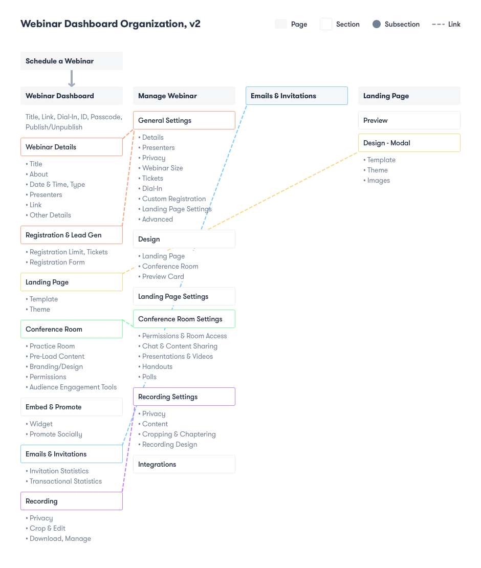
Version #2
Engineering constraints in Version #1 brought me back to the drawing board. Version 2 is a more holistic approach.
What is the first page a host should land on after scheduling a webinar? What information should always be readily available? How does a host navigate between various pages?
In order to highlight important features, an overview dashboard links to the corresponding sections on the Manage page.
Important information, such as the shareable webinar URL and Quick Links, was given more prominence for easy access.
User Feedback
At this point, we conducted user testing to validate the concept of an overarching dashboard.
The concept was tested with BigMarker users and non-users, and we recruited people who regularly use webinar software or are digital marketers.
Overall, users were able to complete every task they were given.
Takeaways: Quick Links are a useful, easy navigation tool. Essential tasks, such as copying the webinar link to share it, need to be more obvious. The dashboard that provides an overview is more effective than the current organization. Linking from “Edit” links on the dashboard to the manage page is confusing. There are too many items to look at, and it is disorienting. Some confusing terminology.
Version 3
Now it was time to circle back with the engineering team.
Instead of linking from the Dashboard to the Manage page, what if the Dashboard was the only page? What if editing happened in a modal?
After pitching this concept to the engineering team, we validated the concept of full-screen modals with users.
Success! Users no longer felt confused or disoriented when they clicked “Edit.” The tasks felt simple, focused, and easy to complete. Additionally, navigation back to the dashboard was more obvious.
Final Solution: Phase 1
In order to strike a balance between company resources/priorities and user needs, this project was turned into a 2-phase roll-out.
Phase 1 merges the existing framework with the dashboard structure & modals.
Final Solution: Phase 2
Phase 2 will replace the existing framework with an updated framework that will allow the product to grow & remain organized.
It includes Quick Links, editing on the page & modals, an analytics overview & in-depth page, and more.


